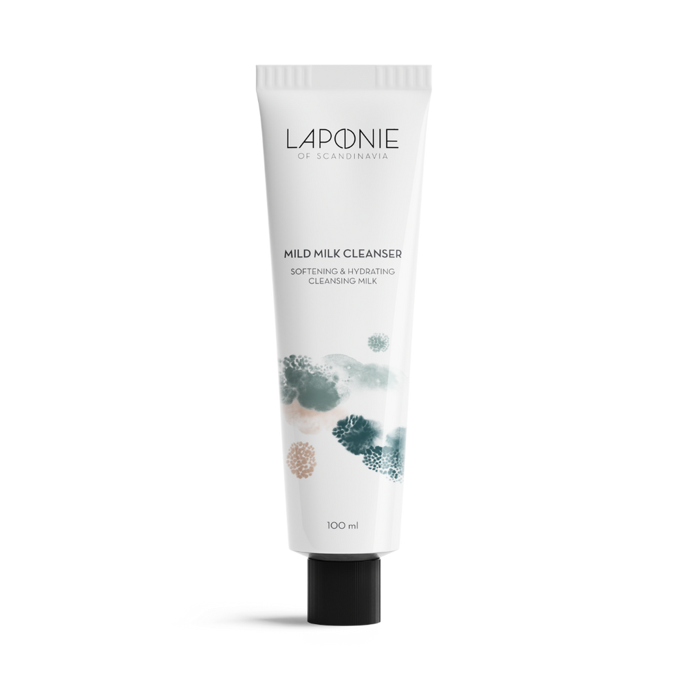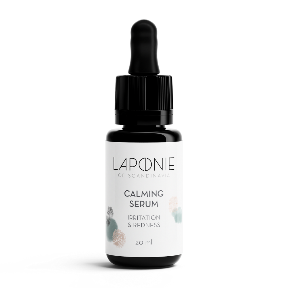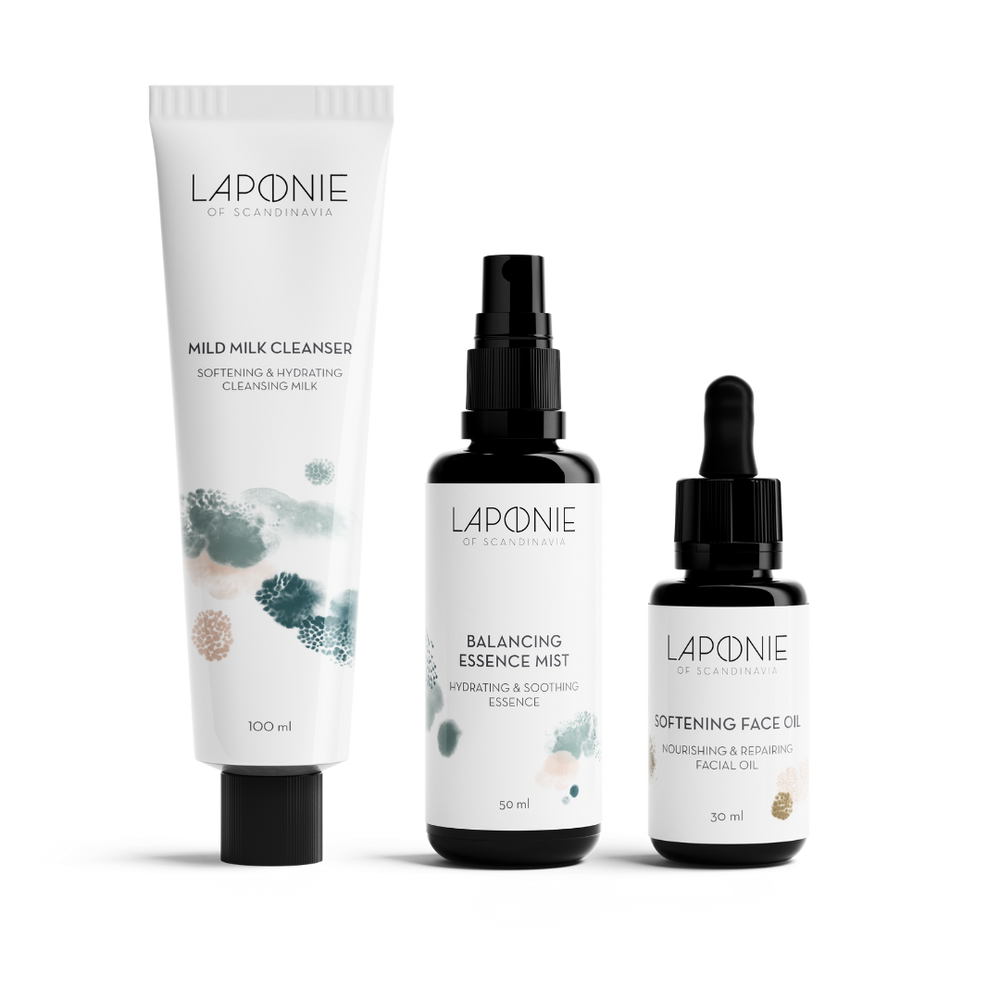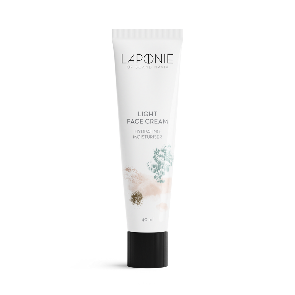
WHAT WAS THE PROCESS LIKE WHEN CREATING OUR LOGO?
I usually take a bit of an academic approach to design, and always start with some research. I never feel ready to work on visuals before I feel like I've grasped the relevant context of a brand.
In this case, since the Scandinavian origin was an important part of the brand story, I knew that I needed to dig deeper into the history and culture – and from there, I stumbled upon the world of Sami symbols, which then provided interesting visual inspiration.
The "o" is an adaptation of a symbol used by the Sami. The original symbol, a circle with a line drawn vertically through the centre, represents the sun and the moon, balance, and the Sami world view of living in harmony with nature. It originally was painted on traditional drums, and also appears as the main motif on the Sami flag. As a brand with a strong Scandinavian origin, it felt right to create a logo rooted in its cultural heritage.
HOW DOES THE LOGO INTERPRET THE NO-NONSENSE IDENTITY OF THE BRAND?
The values of balance and harmony symbolized in the "o" are directly connected to the brand's commitment to purity, quality, health, and sustainability. A minimalistic approach to the ingredients as well as honesty and transparency are also a key part of the no-nonsense identity – so the logo needed to visually reflect this simplicity and directness in its overall look and feel.
YOU ALSO DESIGNED THE PACKAGING ITSELF, USING AINO-MAJA METSOLAS ARTWORK ELEMENTS. TELL US BRIEFLY ABOUT THAT PROCESS.
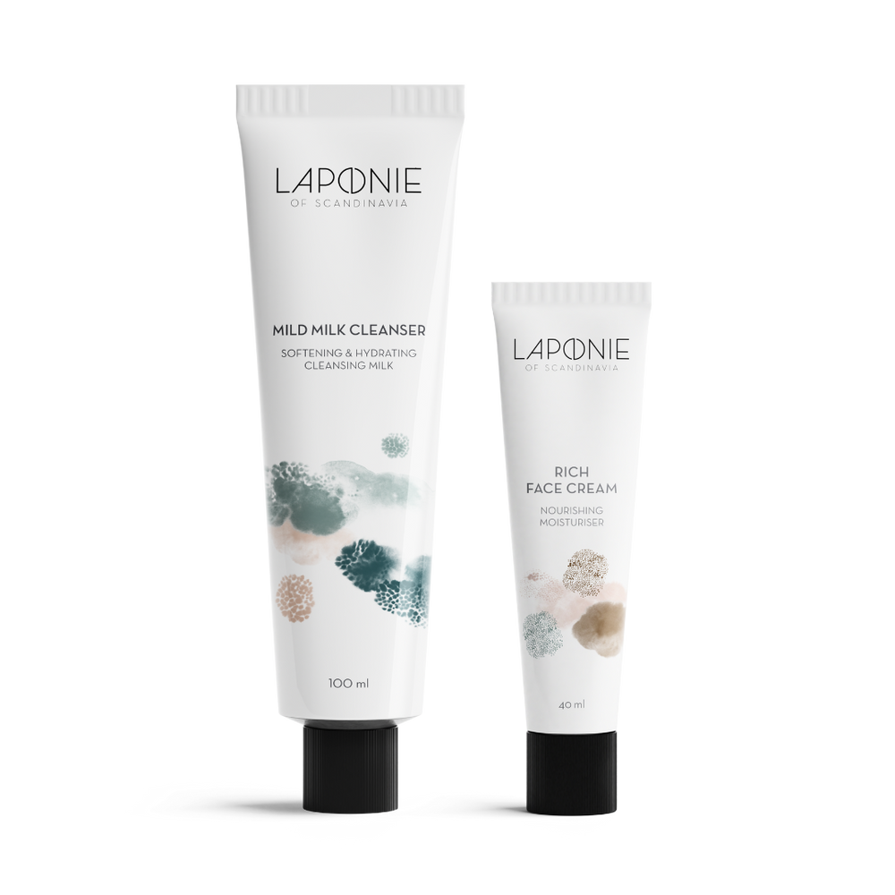
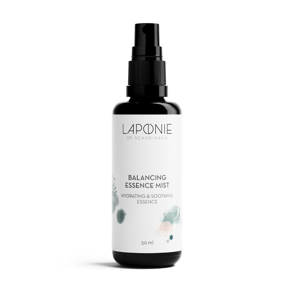
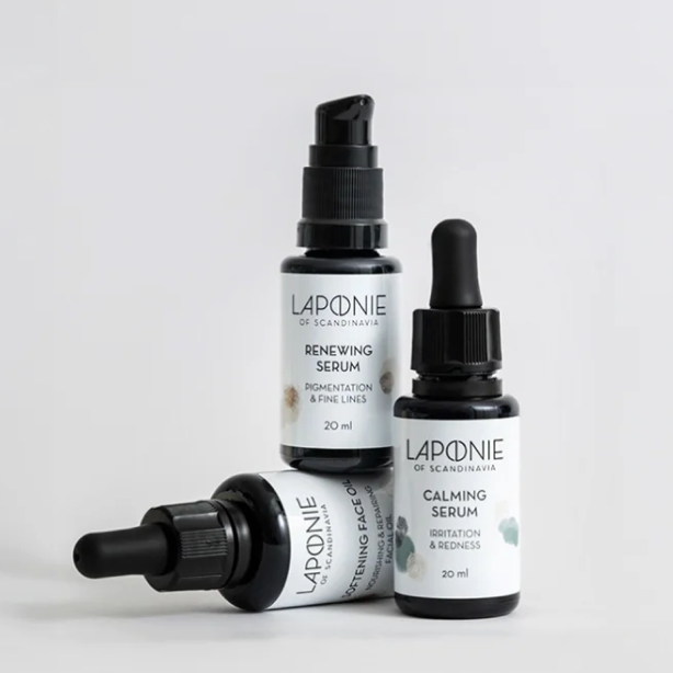
We felt from quite early on that Laponie needed a unique visual world, so illustration felt like a natural direction. In keeping with the Scandinavian heritage of the brand, we really liked the idea of using a local artist, and since Laponie is a passion project, it was also important that the artwork resonated personally with founder Kristina.
Aino-Maija turned out to be the perfect fit. We gave her a fairly loose brief, asking her to interpret the concept of "skin days" from a Scandinavian perspective. Her technique is to paint by hand and then create compositions digitally, and we fell in love with the result – textures and patterns evocative of the beautiful, moody Scandinavian climate and landscape. What she has created is one large-scale composition, a Laponie universe, from which each individual product takes cropped elements.
You can read artwork creator Aino-Maija Metsola's interview here.


